SDSU Theatre
Centennial Season Campaign
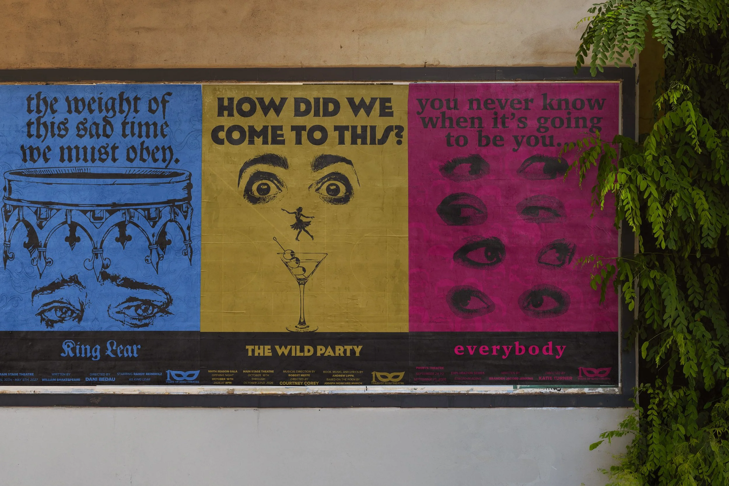
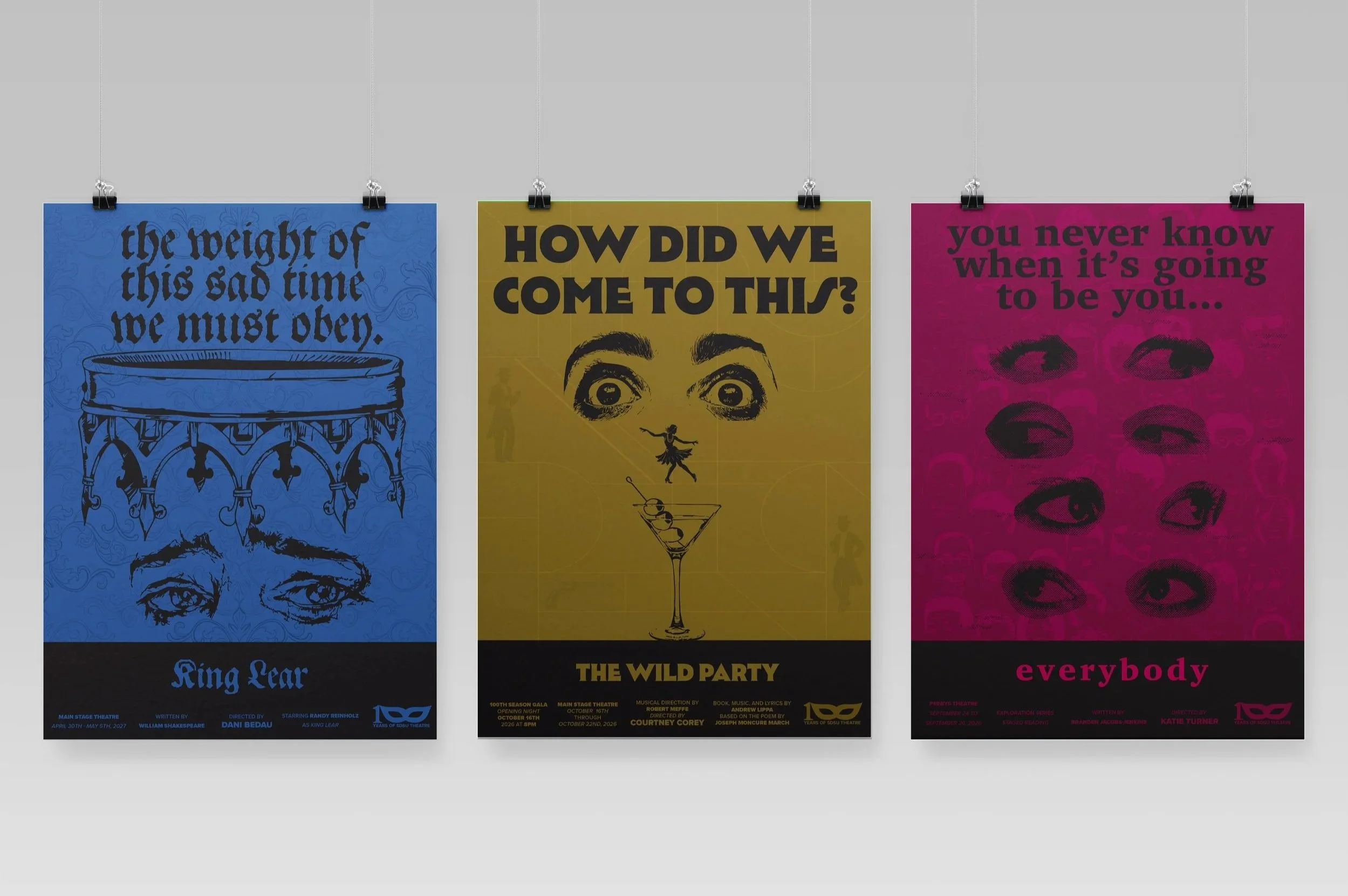
Series Design / Art Direction / Visual SystemsDeveloped in an invitation-only studio class, the SDSU Theatre 100th Season Campaign explores how visual systems can capture the layered experience of live performance. The project moves beyond traditional promotional design, using abstraction, symbolism, and illusion to translate narrative and emotion into a cohesive campaign.
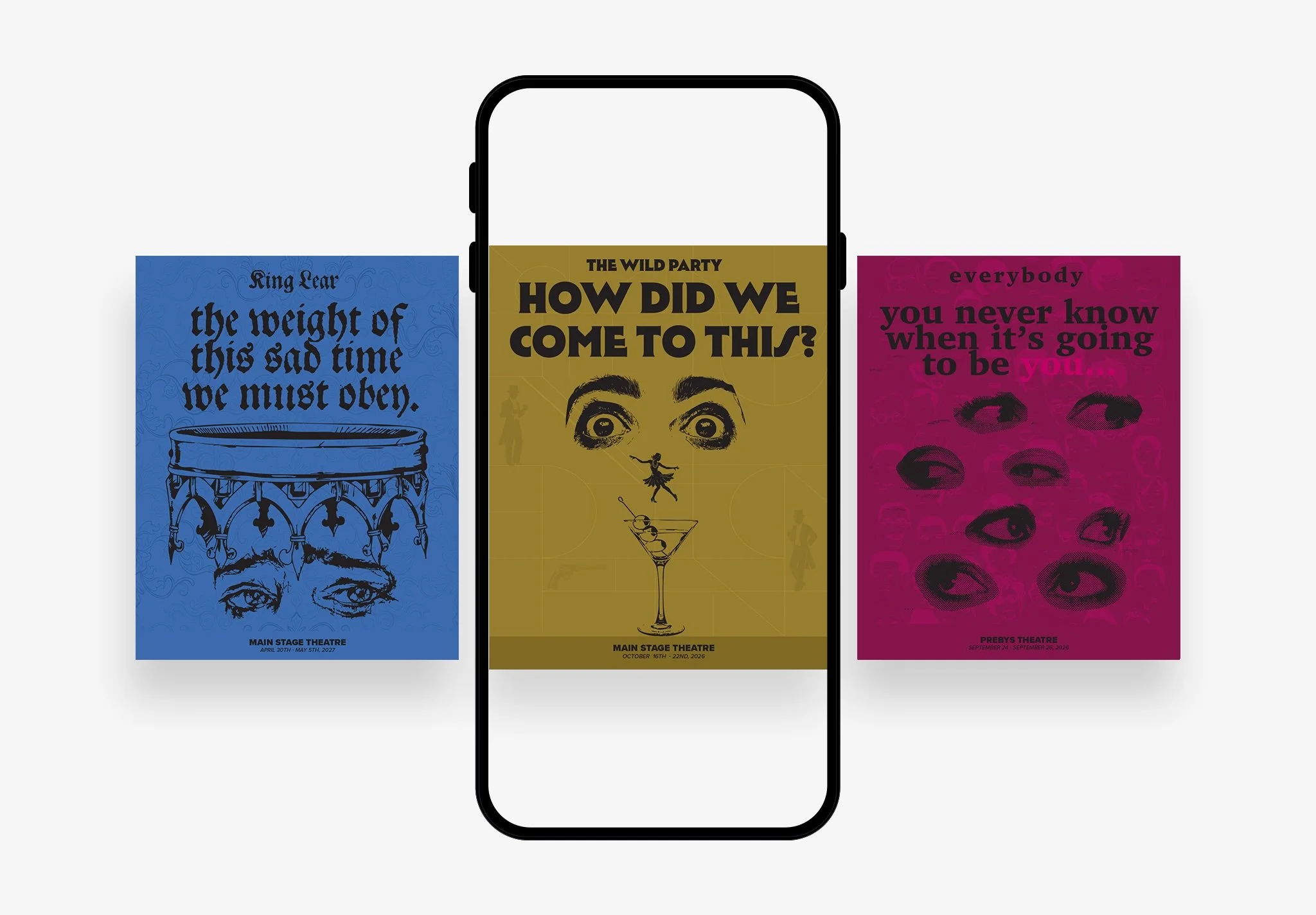
Spanning posters, digital assets, and a commemorative identity, the work balances individuality and cohesion, allowing each production to exist within its own visual world while contributing to a unified seasonal identity.
king lear
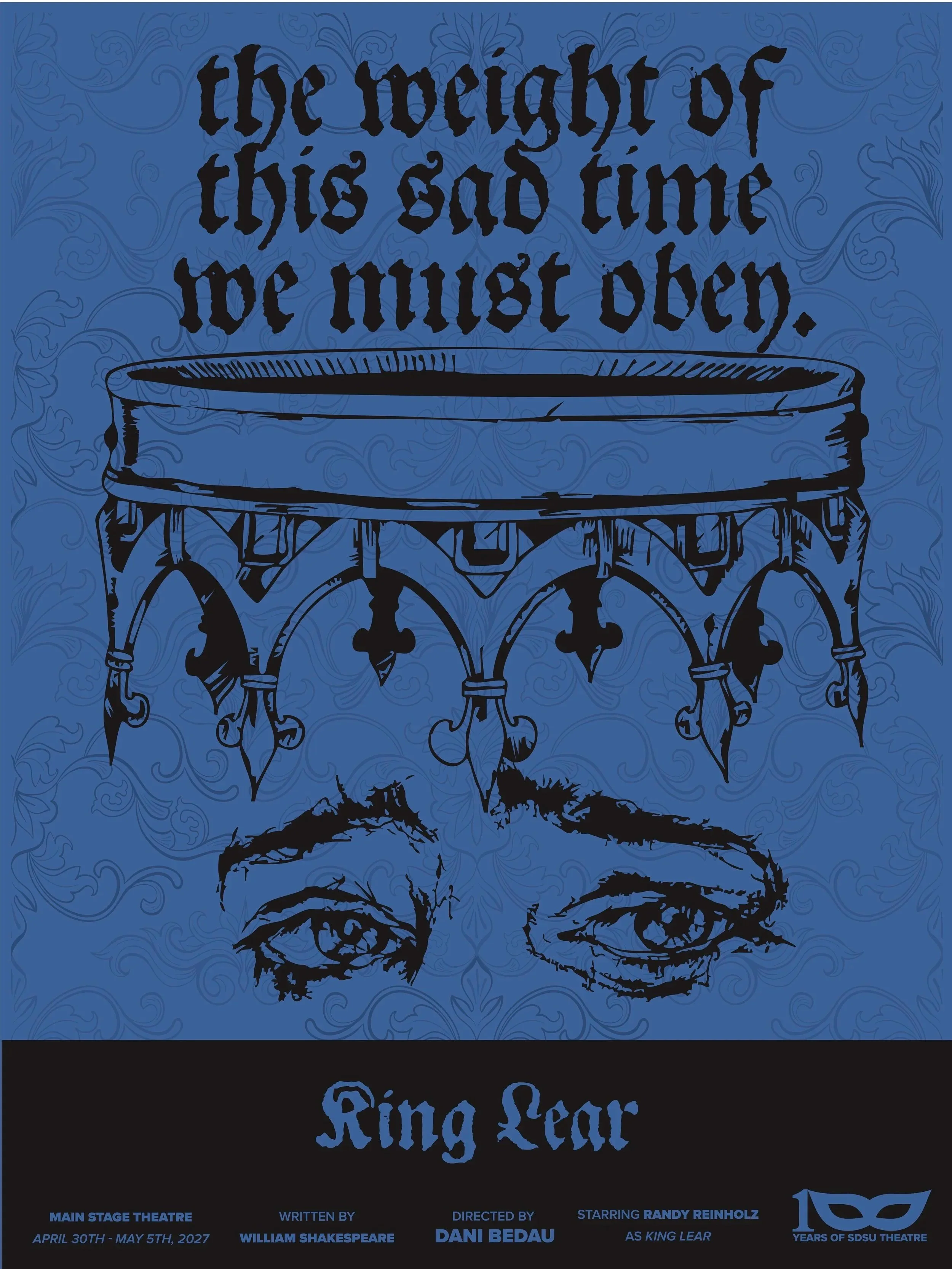
The King Lear poster centers on the instability of power and psychological unraveling that defines the play. The muted blue background references traditional royalty but is overlaid with a decorative pattern to suggest the fragility of power.
The inverted crown, signaling a world in disarray, the eyes evoking psychological fragmentation, reflect Lear’s descent into madness. The style reinforces the idea that power is ultimately an illusion, no longer protective, but instead oppressive and rooted in fear.
The wild party
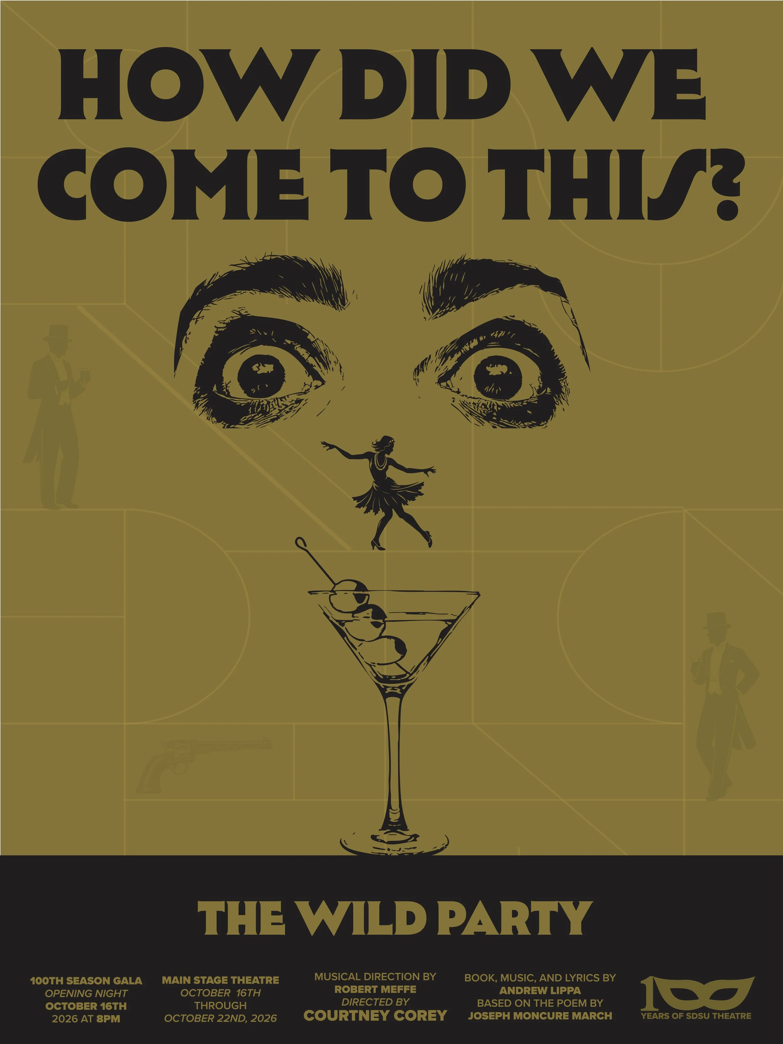
The Wild Party poster explores the tension between glamour and chaos that drive the narrative of the show. The vibrant green background and ornamental pattern reference the glamour of the jazz age, while the period inspired-typography ground the design historically.
This elegance is disrupted by a surreal facial composition formed by fragmented elements, fearful eyes, a dancing figure, and a cocktail glass, suggesting a woman caught between desire and danger. These components reflect the show's themes of excess, toxic love, and how liberation pushed to its limits spirals into recklessness.
everybody
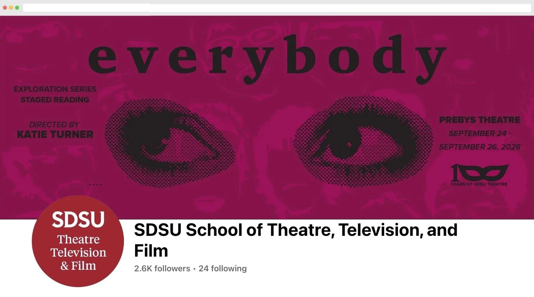
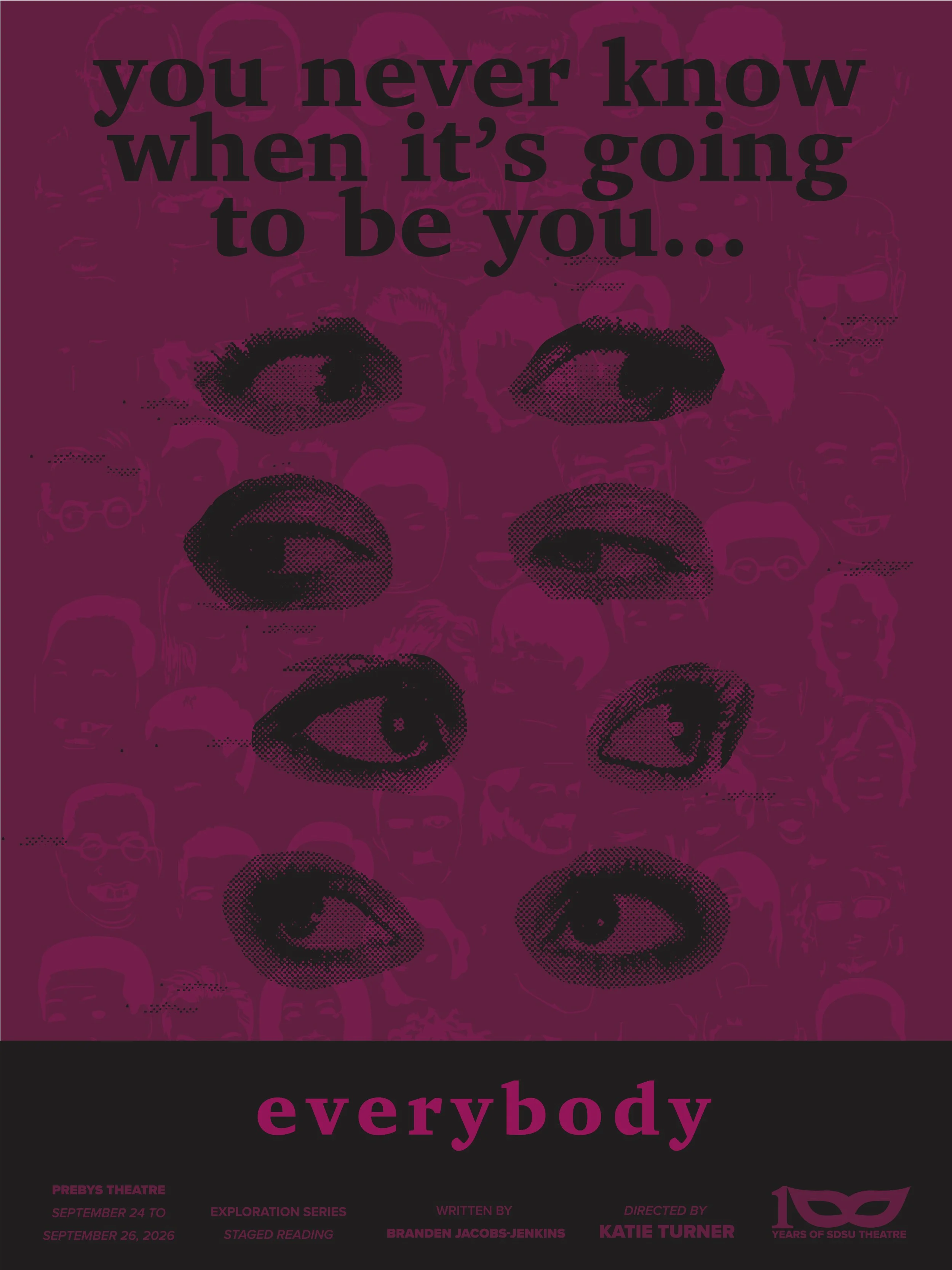
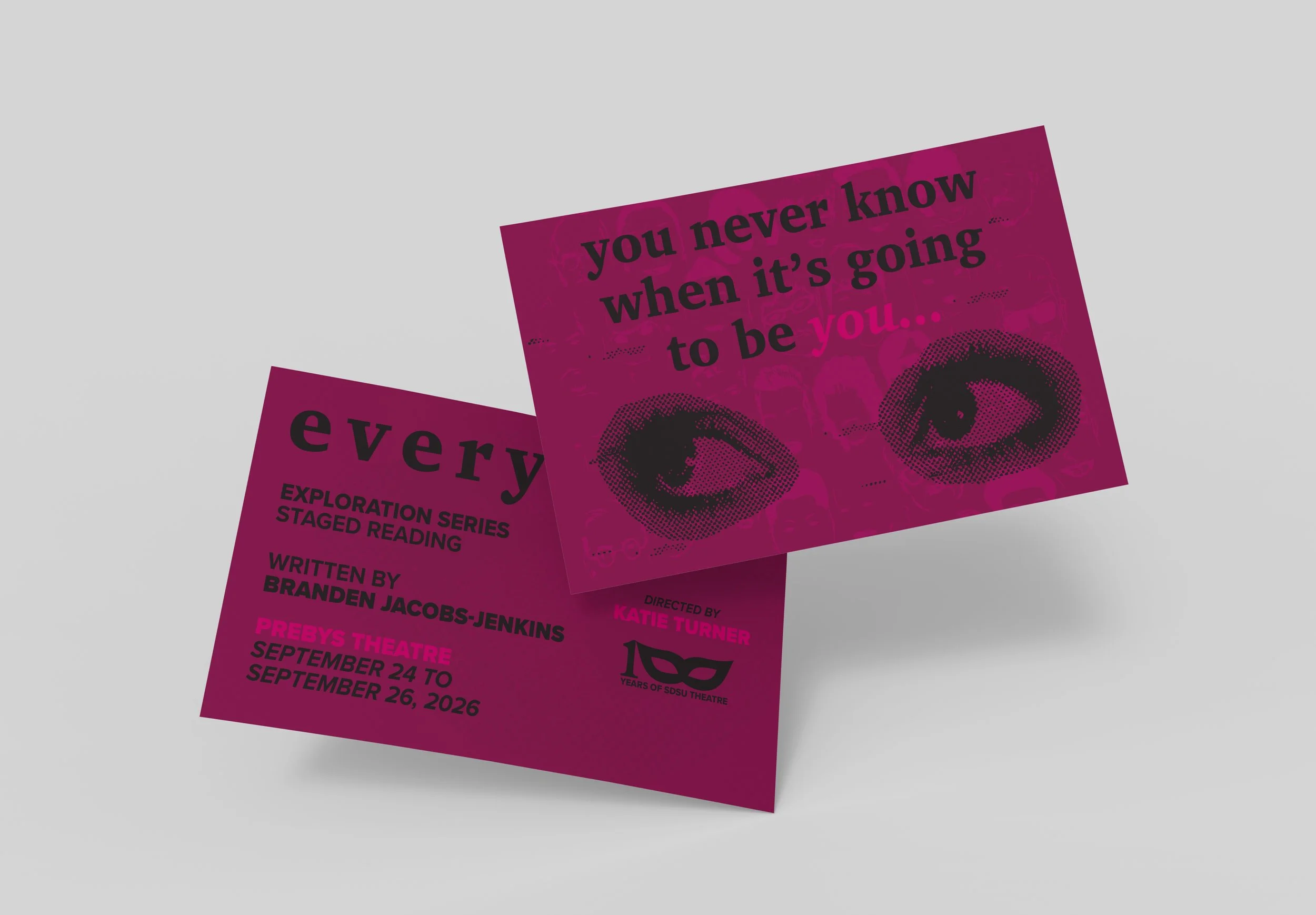
The Everybody poster centers on the unpredictability of life and death, reflecting the play's exploration of the shared human experience. The use of bold pink color blocking introduces an almost playful tone, contrasted by a faint background texture composed of diverse figures to emphasize universality.
Layered on top, multiple eyes looking in different directions create a sense of randomness and unease, symbolizing the inevitability of death and the unpredictability of who it will affect.This motif also references the production's lottery-based casting system where roles shift each night, reinforcing the idea that identity and fate are fluid.

logo
The 100th anniversary logo combines the numerical milestone with a symbolic reference to theatre through the integration of a masquerade mask. By shaping the 100 into a mask form, the design visually merges celebration with meaning, using the mask as a representation of performance, transformation, and identity.
This choice reflects theatre's foundation in storytelling through assumed roles and shifting perspectives. The simplicity of the mark allows it to be highly adaptable across formats, while the bold structure ensures immediate recognition.
Supporting Marketing Assets
social media
postcard
facebook cover